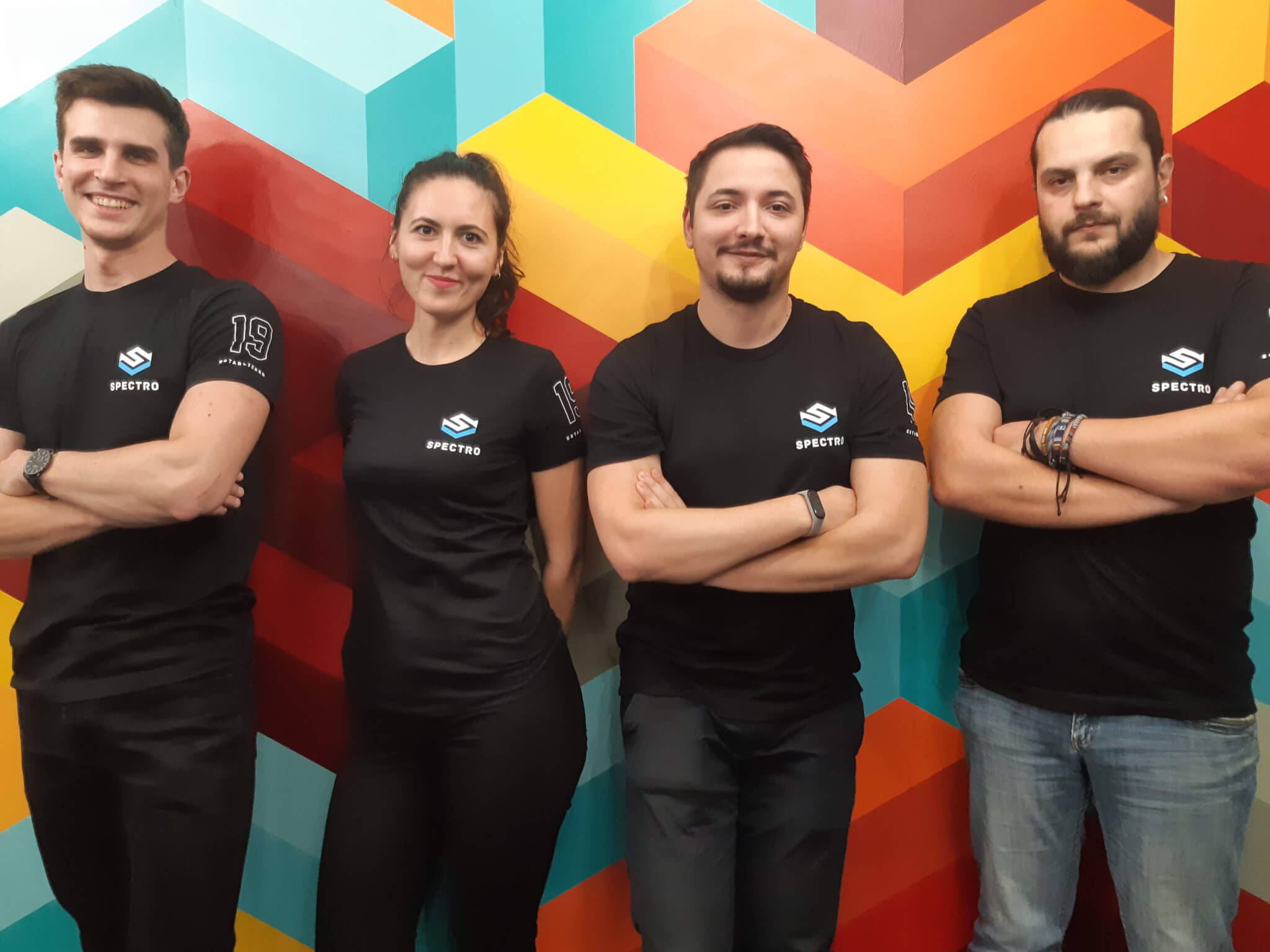
When Spectro Cloud officially launched in March 2020, with a $7.5M investment to “help developers build Kubernetes clusters their way”, we felt nothing but pride. While current global circumstances are challenging, our partnership with Spectro Cloud is one of the things that give us strength and confidence in the future. In order to understand why, however, one needs context. To that end, it is our pleasure to provide a glimpse into how we successfully partnered with this innovative startup and how our team contributed to the startup’s success.
Spectro Cloud: Kubernetes Your Way, Anywhere
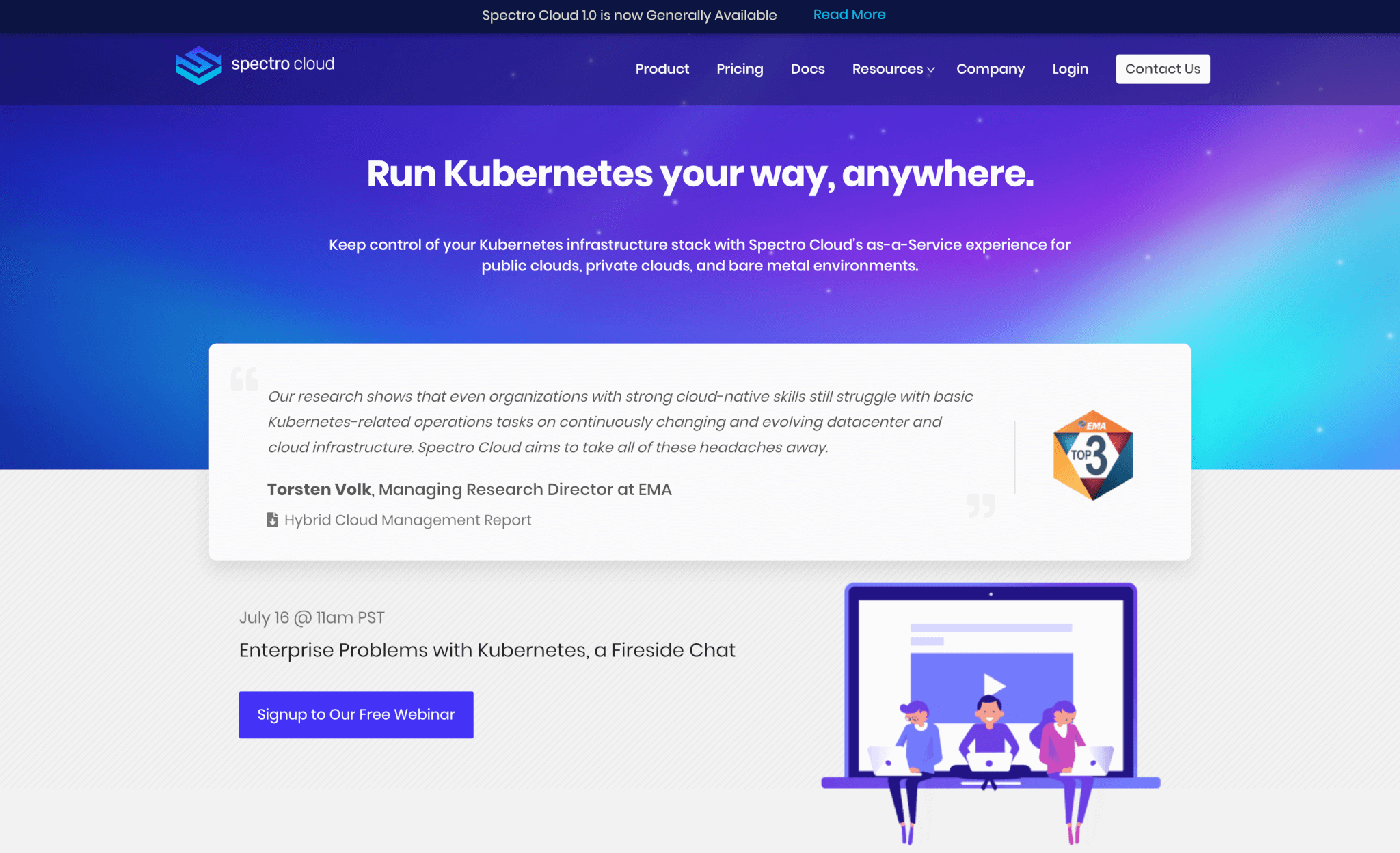
Spectro Cloud is a SaaS Kubernetes management platform that helps enterprise companies “run Kubernetes their way, anywhere”. This tool, designed for enterprises with flexibility and manageability needs, allows management of entire infrastructure stacks for cloud native workloads on multiple clouds.
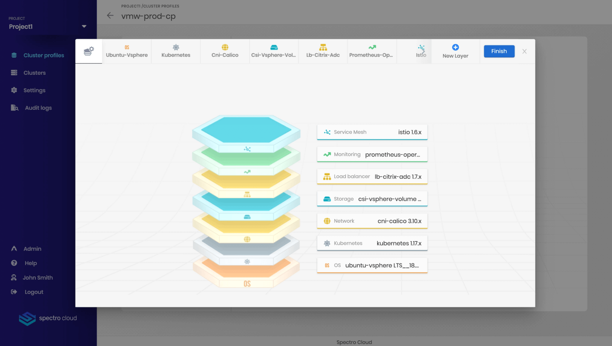
Spectro Cloud handles the lifecycle management of Kubernetes infrastructure stack, from operating systems to Kubernetes versions, storage and network integrations, to other integrations for improved security, monitoring and logging – all in an automated manner. Cluster infrastructure is described via declarative infrastructure policies called “cluster profiles” which enterprises have full control over, while the Spectro Cloud system manages the pain of day two operations and keeping deployed clusters compliant to policies.
Bytex Involvement and Tech Stack
As we dove into the world of DevOps, we traded our knowledge of UI & UX for valuable knowhow partaking to Kubernetes, infrastructure, cluster and cloud orchestration. We used ReactJS and Redux for UI, with redux-thunk as a middleware for more complex operations, such as the API requests. Ant.design was the library of choice when building UI components, and Figma won the UX game alongside Miro, which we used for research and analysis.
Assembling the Team

We joined Spectro’s team at the earliest of stages, armed with enthusiasm and curiosity: for us, the DevOps environment still had elements of novelty, so we were very excited to better our understanding. Having had previously collaborated with the customer’s core team, most of our developers were already, in a sense, acquainted with their approach and expectations, this probably being one of the reasons why Spectro decided to trust us with such an innovative project.
Time also played an important factor, as Spectro Cloud was about to enter a highly competitive market with its product, and things needed to move fast. Being in close contact with the customer’s core team, prior to the official kick-off, we had already ”reserved” the right people for the job, having both a UI architect and a UX lead ready to hit the ground running. With leadership in place and technical specifications understood, pitching the project to new colleagues was an easy task for our HR representatives, who ensured that the new-joiners were exactly what Spectro were looking for.
After assembling a solid team of professionals (of all seniority levels), we set off to the US for a layover, so that everyone could meet in full formation and establish next steps (tackling a business idea as complex as that of Spectro Cloud needed a close, firsthand collaboration). Adopting a Lean Methodology was the way to go, with the conceptualization stage involving everybody, from CEO to junior developer. We based our plans on an Ideation Workshop, which favored alignment and provided a comprehensive overview of all focal points, from scope, vision, mission, actual product and priorities.
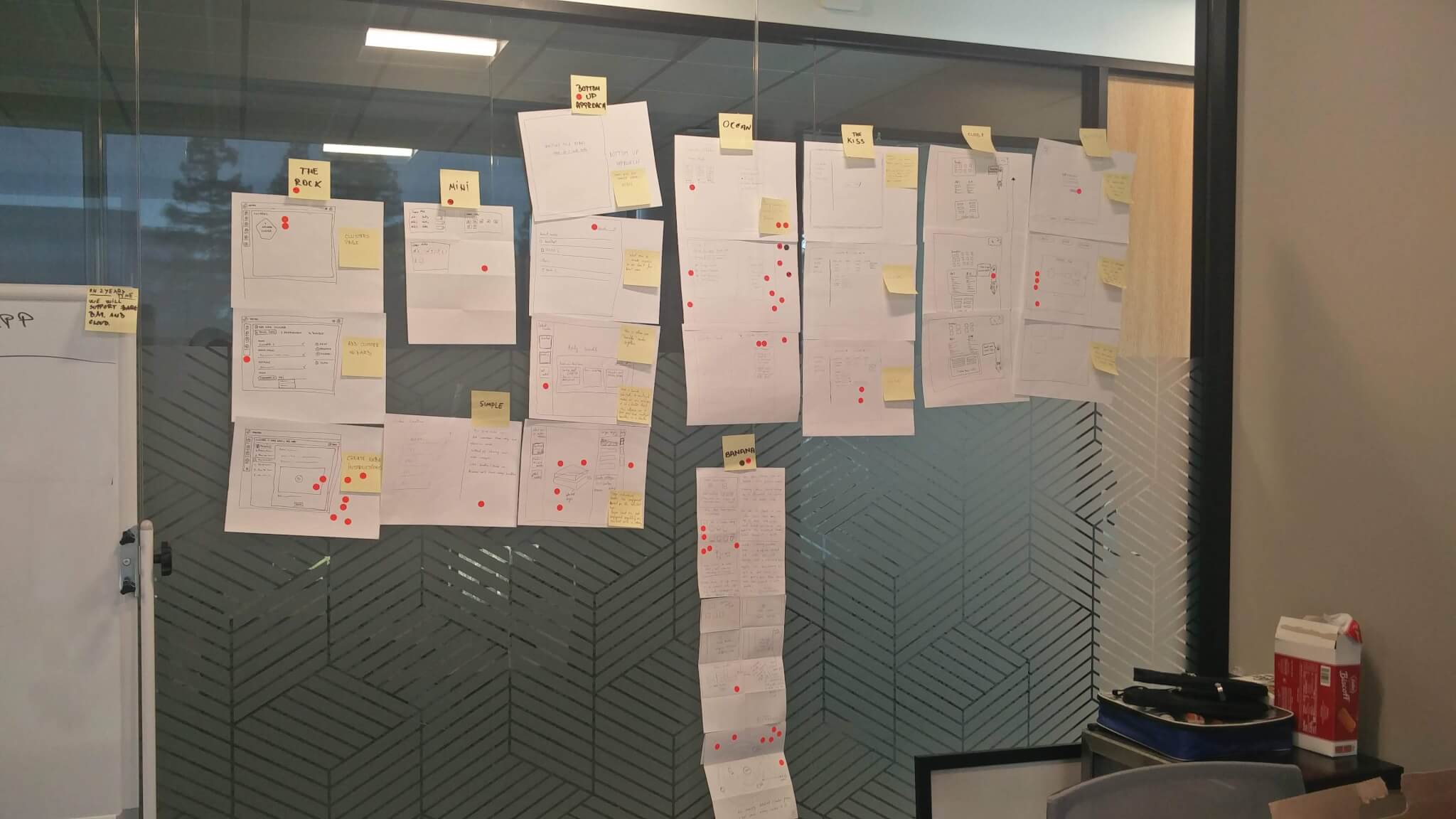
UX, UI and Ideation Workshops

To start building the UI, the teams had numerous meetings to understand both the business and the UX requirements. They proceeded to combine them, and, in this sense, created an initial UI architecture that could be easily adjusted to the rapidly emerging React ecosystem. On top of the architecture, the team started making a simple CRUD UI using a mocked API server, which helped them understand the interdependencies between different entities. As the UX flow was created, the UI improved bit by bit and optimized the simple forms into wizards, with steps and validations, and tables into lists of cards.
The UX also had its fair share of important contributions. Since we were mostly working around an idea that had been previously validated by investors and peers, contouring a lean, sleek concept, and creating a clear direction on how the product should be designed were undoubtedly the first steps.
Brainstorming was key, in terms of both direction and time efficiency; having the UI and API teams involved in this process ensured a clearance in the product’s vision, allowing them a head start as they understood the business logic and the UX architecture.
Afterwards, as the front-end and back-end teams were starting to work on creating the setup and the necessary infrastructure, the UX lead used Lean UX as an iterative cycle, creating prototypes for core features and reiterating them based on the customers’ feedback. Using Figma was a very inspired choice, as it not only eased contribution by allowing everyone to comment and see real-time updates (which also proved to be very time efficient), but also provided support for many formats, such as vectorial layouts and prototypes, making it a “jack of all trades”, cost effective tool – ideal for a startup. With everyone having a clear common vision on the product’s trajectory (and thus very few blockers along the way), and with the first stable versions of the prototypes ready, implementation became possible.
Pacing and Time Zones
Even though Spectro Cloud was not the first startup we worked with, the exceptionally fast paced environment caught us slightly off-guard. Due to the complexity of the field, numerous technical and non-technical requirements were changing rapidly, and adjusting to dynamic elements – such as user-interface systems or APIs – put our code base at test. Fortunately, the architecture we built was flexible, and some of the modules were reusable – this enabled us to achieve the proper velocity of a startup agile team in no time.
Of course, quick changes and even quicker solutions impacted the UX perspective as well. Based on the feedback of a broad segment of users from KubeCon 2019, several business decisions were made that led to the UX having to shift flows in order to ensure alignment with present requirements, instead of future ones. Thankfully, having an altogether iterative process, and having previously validated everything through prototypes enabled a quick implementation for the necessary changes, regardless of how fast paced the requirements were.
Surprisingly, the time zone differences enabled us, rather than impeded us. Naturally, figuring out a common schedule raised certain difficulties, but once we got a timetable in place, we used all our resources in order to uncover all the project’s corners and see things in a broader perspective – 24/7.
Achieving Results

With forces and ideas aligned, showcasing Spectro Cloud’s premise through an MPV (Minimal Viable Product) helped the company validate its hypothesis, and the following iterations brought out the value of such a technology on the market. The release of the Beta version and the Spectro Cloud website was a huge moment for everyone, the company having its first official milestone and launching its product, while working with 16 beta customers. VCs such as WestWave Capital, Boldstart Ventures and Sierra Ventures chose to invest in Spectro Cloud’s vision because they believed in the people behind itl, the tool’s complexity and the power users’ need for such a comprehensive product.
The story doesn’t end here. We are still involved in the project, as we’ve already switched methodologies to adapt to a newer level of collaboration and product maturity, and even though we’ve recently experienced the excitement of a first launch, we’re heavily preparing for the GA (General Availability). We can’t wait to see what the future has in store for us.
Interested to learn more about how we helped our partners? Read about our work with OnScale, the cloud simulation platform, and about our UI/UX contribution to Webex’ homepage.


