In the dawn of the work-from-home environment, where video conferencing systems quickly became the stars of the show, we count ourselves lucky to have worked on the Cisco Webex portal, as we had the chance to bring our contribution – be it with UI services – to the ”new normal”. We worked with Webex on two main components: the homepage and the devices page, respectively, with a tech stack consisting mainly of Javascript, CSS and Adobe Experience Manager. Each page came with its particular set of challenges, which our team overcame with flying colors. Continue reading to find out how.
Refreshing the Cisco Webex Main Page

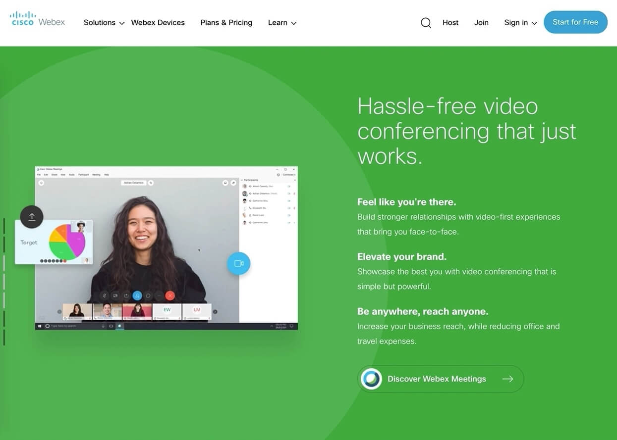
While we’ve been working with Cisco for several years, our involvement with Webex began in the fall of 2019. Our plan was to implement animations on the Webex homepage, with the ultimate goal of obtaining an improved and refreshed user experience. Discussions started from an existing mock-up, with developers and designers giving extensive feedback on what was to become the final version of the design.
The most important challenge for our team was learning to work with Adobe Experience Manager, a platform which we weren’t acquainted with at the time. We quickly started looking into how AEM works, as we analyzed best practices and uncovered its hidden insights.
Secondly, we had to fight the neverending fight against unfamiliar code. Upon starting our work on the existing production website, our team had to become acquainted with the website’s architecture, as it was thought out by previous developers. The deeper we dove into the code, the more ideas we started having, with the findings translating into a secondary goal, that of making the main webex.com page as responsive as possible.
Innovation wise, we wanted to build a system for inserting controlled animations, so that the whole development process would be as smooth as possible and, of course, easy to maintain. The animation system was quite simple, as we kept it tied up to the user’s scrolling area within the page. It essentially checked which section was in the viewport, and subsequently activated the desired animation, with all its child elements.
With the animation system in place, pending feedback from relevant departments, finishing up the project was just a matter of time.
The finishing touch was creating a fixed sidebar scroll, in order to facilitate the navigation between the page’s main sections. Implementation was not complicated, as each section had its own title and coordinates which we could correlate each time a user interacted with the page.
Working Through the Devices Page

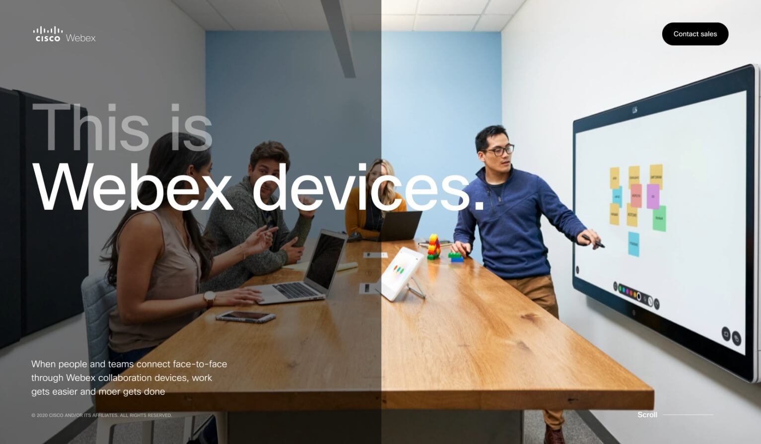
Moving to the devices page, the main goal was to create a complete web page, from scratch, that followed the direction of a live video, while scrolling through the content. The main advantage of the page was the scroll behavior, as it was supposed to be completely custom and was known to have a major UX impact on users.
We began with research and documentation, so that, once started, the development process would be as smooth as possible. We decided to go with a system that interprets a timeline object (in which we had saved specific animations for each section). We had to be extra careful with performance, as the animations we added were made with CSS, which is known to cause performance issues if not handled correctly.
Once we had all processes in place, we prepared the first prototype version and had the page ready for its first DEMO. It was quite the challenge, as we had to deliver in a short time frame, collect feedback and continuously adjust our prototype.
The overall feedback on the first DEMO was very good, but in order to improve the page’s impact on users, we had an additional request: a native, vertical scroll that was not included in the original plan, and was not part of the vertical scroll system that we had already built. We went back to our drawing board and upgraded the system so that it was able to support switching between scrolling types.
Once the new functionality was implemented, we started working on the latest requirement, which was to support overlays for different sections (meaning, when the user would click on an element, it should provide a zoomed view of its details). This functionality was not difficult to implement, so we were already planning our final DEMO in “no time”. The feedback was positive, with only small change requests from the marketing and sales departments (updating images or text, deleting /adding new paragraphs, changing styles) in order to have everything ready for production.
The overall video animation style of this new page had a very good impact, and we subsequently received requests to transform other parts of the Cisco Webex website in a similar manner.
Curious to learn how we helped other companies? Check out our Ciitizen success story and our overview of our partnership with the MIT.


