Last week we posted our first installment of the #uxatbytex video series on our blog. Feel free to check it out for information about context, mission and content.
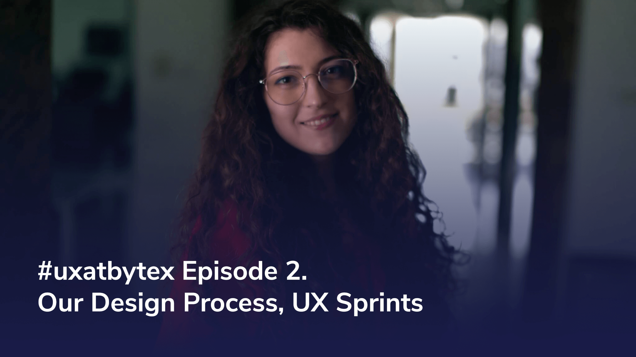
It is our pleasure to follow up with the second presentation, starring the lovely Iulia, who will discuss our design process and UX sprints.
Feel free to check out the entire series on our Youtube channel, and to scroll down for the transcript.
Iulia: Hello and welcome to #uxatbytex, the video series dedicated to the intricacies of UX design. My name is Iulia and today we’ll be covering the basic principles governing how to structure and improve your design workflow. Let’s get on with it!
Whether you’re a seasoned UI/UX professional or a novice designer, you must surely understand how important it is to have a well-defined process, as it ensures a safe space that provides creative freedom as well as that expectations are being met and that collaboration is predictable. In the following minutes I will dive into the framework we use at Bytex. We hope that by understanding our five-step process and our workflow timelines you will be able to gather the know-how to set the foundations for your own plans. Keep watching for more!
We approach all of our projects by using our flexible five step process that can be adapted to any business or technical environments.
First off there’s strategy. We start by defining the problem statement and understanding the product’s vision. This way we are able to identify any priorities that will guide us through our UX process.
Then there’s discovery. This implies understanding the pain points users may have when experiencing the product. Once we figure them out, we share our solutions with the stakeholders and the rest of the development team.
After discovery we have analysis. This is where we get all “designery”. We create user personas, user stories, flow diagrams and experience maps.
Afterwards we start exploring, or iterating as we usually call it. This implies everything from sketching and wireframes to creating actual clickable and testable prototypes.
And lastly, we have production. This is where we perform the final user testing. This actually allows us to find any remaining issues, either usability or functional issues that we may have missed prior to sending the specs to the development team.
All this process allows us to reduce the risk of failure while also ensuring a good cross-functional team collaboration. Also, it helps us keep our relationship with the client transparent and professional. As a result, we plan and manage the design tasks based on product priorities.
Speaking of planning tasks, let’s jump right into the concept of UX sprints.
In order to adapt to any development workflow environment, be it a startup or enterprise, we adopted an approach that has time-tracking as its basis. Our UX sprints are usually one week long loops, which accommodate the five-step process I presented earlier. We try to be as agile as possible and deliver good prototypes, fast.
Basically, our sprints consist of think – make – check loops. We start by designing three or four main core functionalities and we conclude the sprints by having clickable and testable prototypes that will need to be validated by customers or other stakeholders. The prototypes will be the baseline for the development team in terms of business logic, UX architecture, styling and implementation decisions.
In parallel, we would also be working on the design system that will make for a smooth transition between UX and frontend.
So, there you have it, our process in a nutshell. Join us next Friday, when one of our colleagues will cover ideation and its crucial part in kickstarting a project.
If you have any questions, please leave them in the comments. Thank you. Bye!
__________
Interested in working with our designers? Drop us a line at hello@bytex.net and we’ll get back to you with all the information you need.


